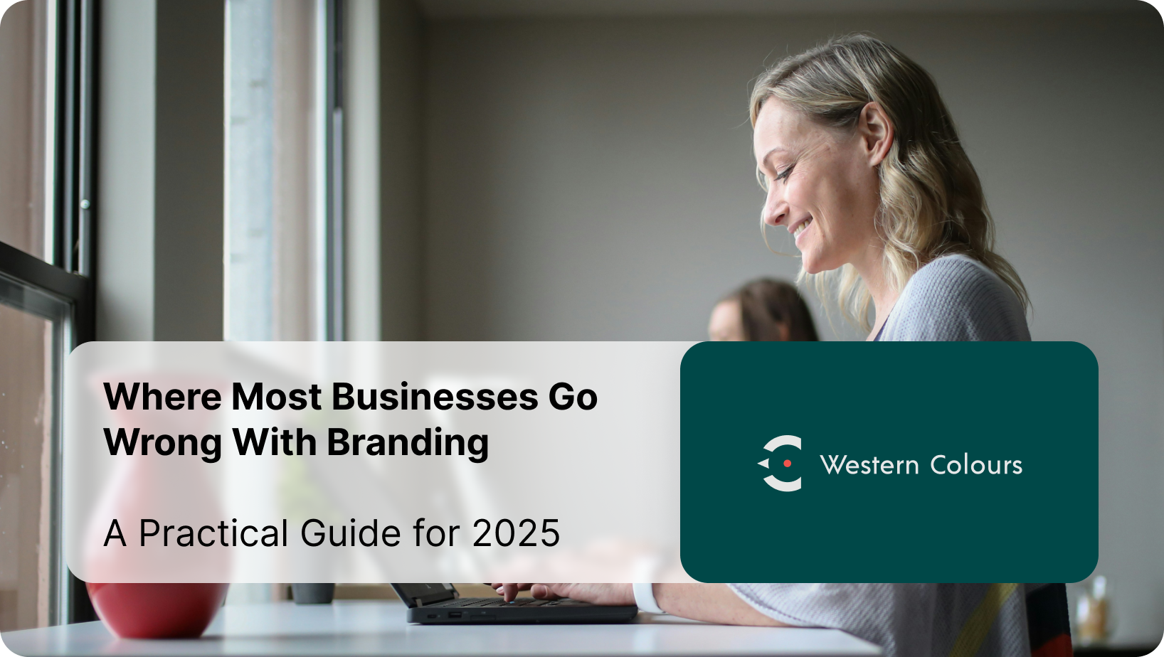
Brand Strategy, Creative & Nearshore Services
Western Colours is a UK-based branding and creative consultancy delivering brand strategy, identity design, storytelling, and nearshore creative services to growing businesses in the UK and Europe.
Recent partners


Success stories
-
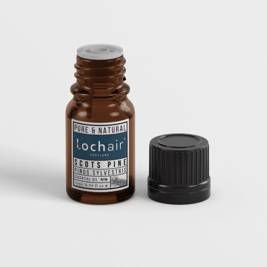
![L form logo filled with photo pf crashing turquoise sea]()
Lochair
Working with Western Colours from the initial concept stage, rather than bringing them in to flesh out the existing concept — was a game changer. Consulting on design thinking right throughout our early founder syncs. The concept and framework of our brand was built on these insights.
-
![Logo with brand-name norse brewery, underneath a logo form of a vikining longboat straight on with a dragons head front and centre and striped sail.]()
Norse Brewery
We were firm on our brand value and vision, Aleks worked with us from the get go, happy to bounce off our vision, whilst bringing it to the next level.
We needed an established packaging design from the off to quickly establish market presence, this has worked well cementing our brand in large grocery retailers. -
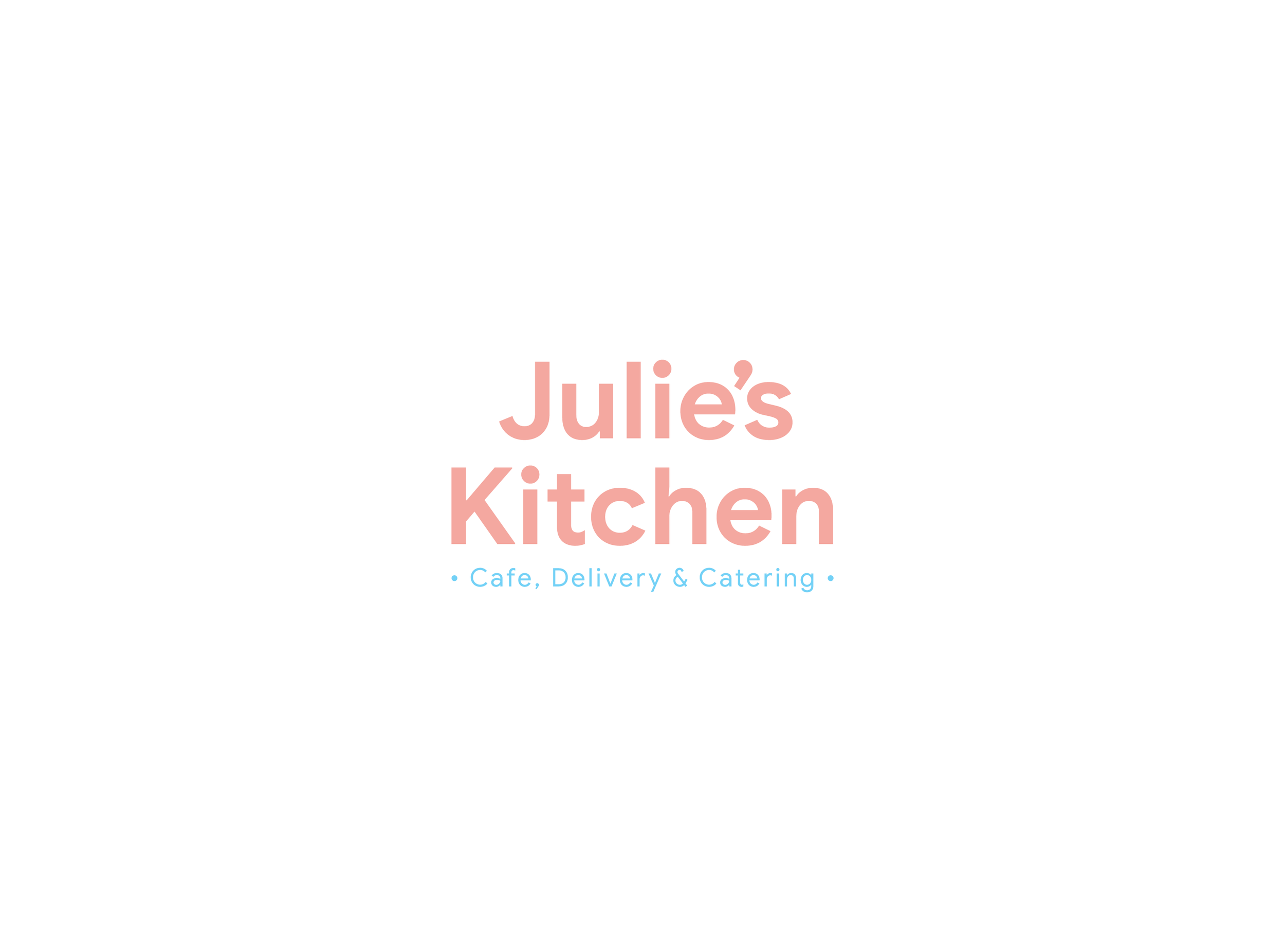
![Type form logo ' julies kitchen' in soft pink lettering]()
Julies Kitchen
Western Colours gave us the confidence to be more disruptive. We had such a blast going through fun ideas, the team were really receptive of our crazy ideas and insightful in the way they interpreted them.
-
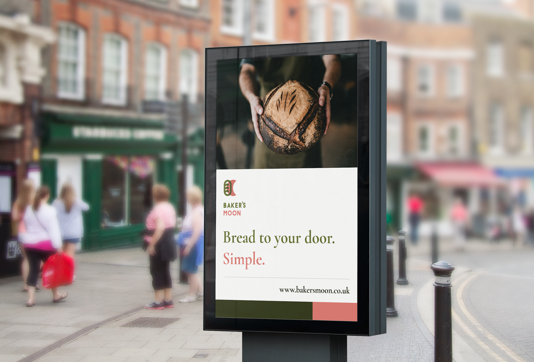
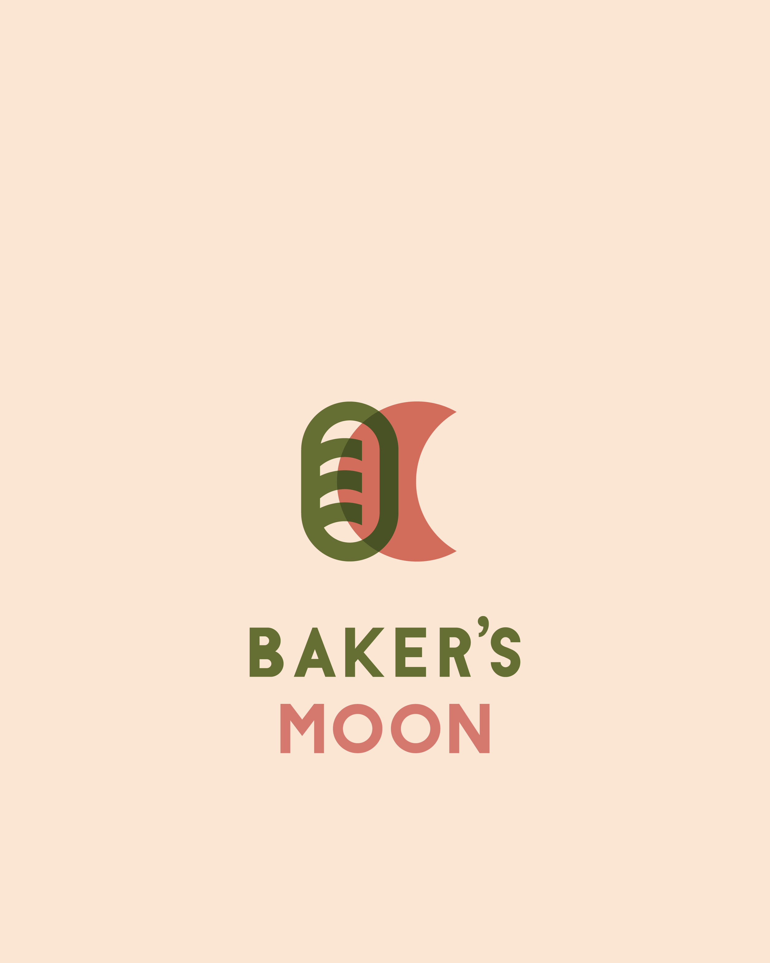
![Logo with simple Bread and moon motif and bakers moon text]()
Baker's Moon
We had issues cementing our market presence, despite great reception, WC were so pragmatic with their approach. Cleverly implemented Market research lead us directly to the solution.


Our services
-
We help businesses define their brand positioning and create a visual identity that communicates value and builds lasting connections.
-
Our team develops creative campaigns and branded content that engage audiences and tell your brand story effectively.
-
Access flexible, skilled creative teams in Eastern Europe while maintaining UK-based leadership and quality control.
-
We conduct market research and brand discovery to uncover insights that guide strategy and creative decisions.
Our work


Lochair Wellness
We worked with the creators of Lochair from the off, generating concepts for the identity. We moved around the concepts of natural, organic, local and therapeutic. Eventually encompassing two words, to creat a mental image and emotional impression by pre-existing associations.


Julie’s Kitchen
After the length of lockdowns, like a lot of business Julie’s Kitchen was seeking a fresh approach to take-out and deliveries. This now being the largest part of the business and with most growth potential. We sought to build a recognisable illustration set that drew the eye, was recognisable, multi functional and encouraged interest.
“To be able to make the customer’s mouth water, to capture their attention, to build recognition and, drive growth from just illustration - is powerful.”

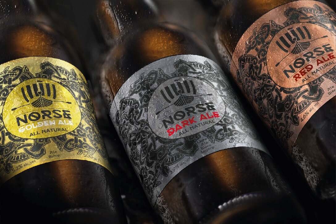

Norse Brewery
We have been working with Norse since its very early stage development. Norse approached us to create brand concepts and a brand strategy, including brand feel, logo, copy, and roll-out in collaboration with the family-run team. We moved around the concepts of Norse mythology, slow-process artisanal brewing, viking concepts, and Norse Celtic art. Eventually encompassing a modern look with traditional patterns, around a clean minimalistic visual identity, expanding on familiar Norse preconceptions and forming an individual modern approach to the interpretation.
“Being based in Canada, working with Western Colours over in the UK has been great. Working remotely hasn’t slowed us down at all.”
Put your brand in it’s place
At Western Colours, we like to get hands on with our partners to craft branding that positions their brand where they visualise it.
From initial ideas to brand identity and strategy, we help you find your market place with a flexible, collaborative approach that delivers meaningful growth and recognition.
*Ask us how we can offer further budget reach teaming up with our sister agencies in the balkans.